SEPTA.org Website Redesign
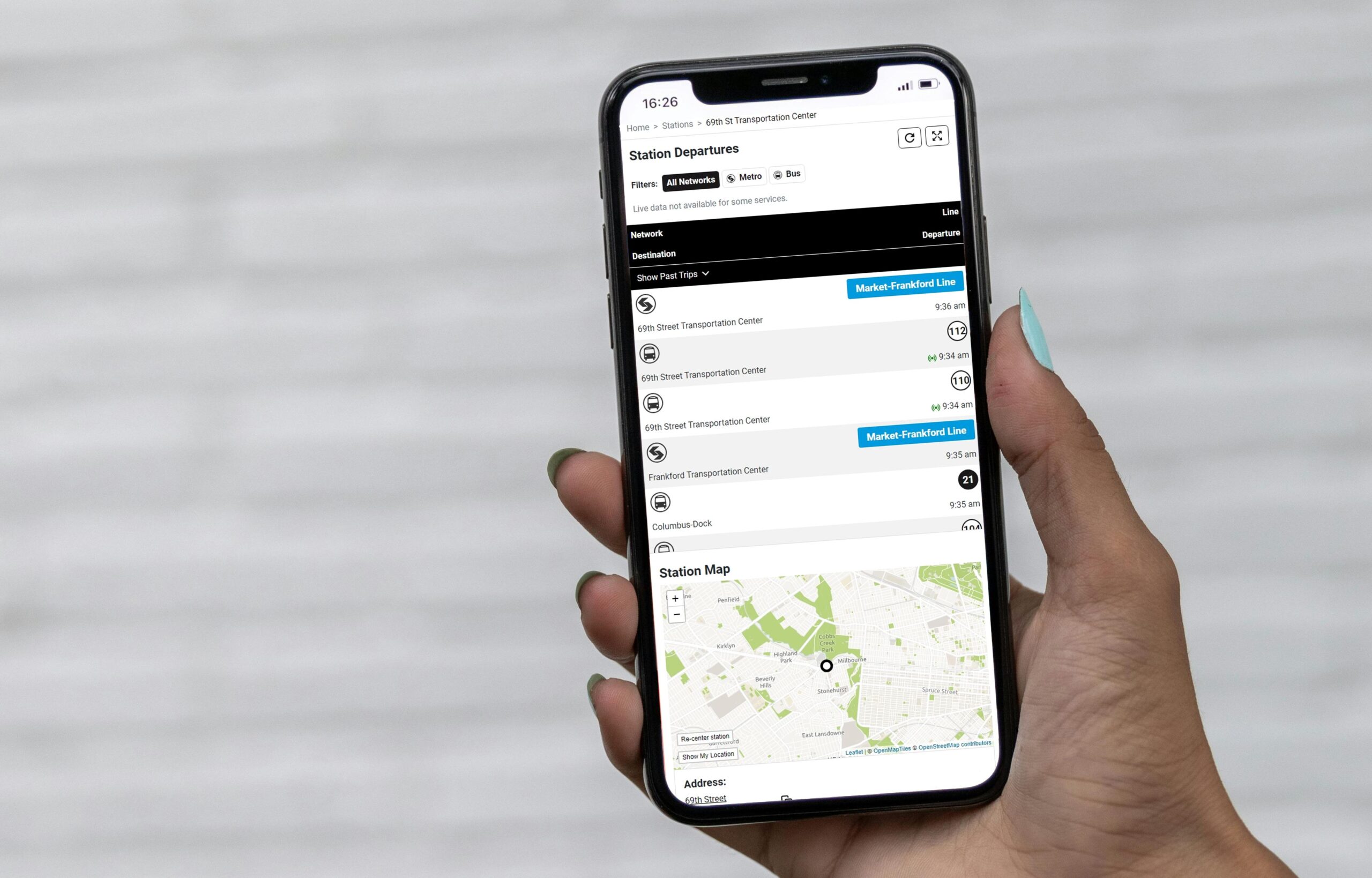
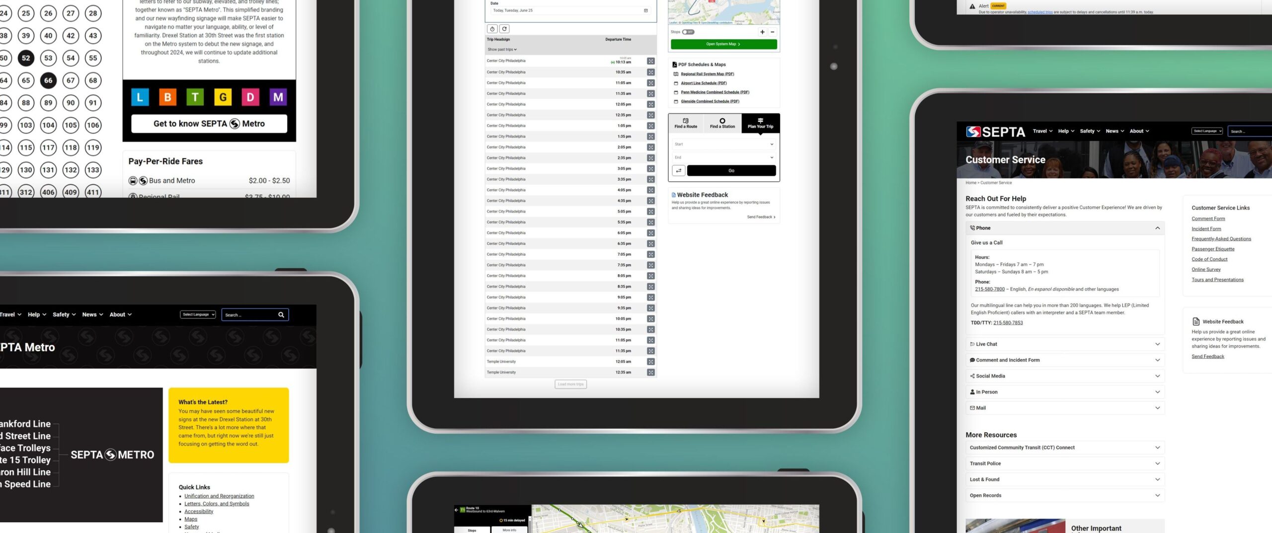
The Southeastern Pennsylvania Transportation Authority (SEPTA) prioritized customer needs, usability, and real-time data in the complete overhaul of their website.
The Challenge
Prior to this project, SEPTA’s most-used online tools and resources for customers were spread across five separate web products. While these products served the same audiences and related purposes, they were designed at different periods and were entirely unique from each other in their designs, organization, menu structures, and underlying technology. The lack of centralization and design consistency across products created an often confusing and disjointed experience for customers, especially when traversing between SEPTA sites. This architecture led to web publishing inefficiencies and an outsized maintenance burden for SEPTA staff.
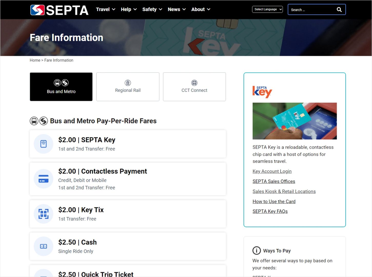
McCormick Taylor’s Creative + Technology Services team collaborated closely with SEPTA stakeholders to design and deliver a reimagined, transit-forward website. This began with an in-depth Discovery Phase focused on identifying the site’s diverse audiences and the challenges they face. The Design Phase prioritized shifting the site’s focus toward customer needs. Merging the existing SEPTA.org website with a related, data-centric web application was essential to streamlining and improving SEPTA’s primary web products. The site and app were visually and technically overhauled to introduce a unified, mobile-optimized user interface and navigation structure—creating a seamless, one-site experience.
How We Helped
Transit is an essential public service—it connects communities, provides access to job opportunities, and reduces dependence on single-occupancy vehicles, helping to cut emissions, ease congestion, and lessen environmental harm. For many users, transit experience begins not on a platform or a bus, but on a screen. That’s why digital product accessibility is critical to helping all riders thrive. As part of SEPTA’s recent website overhaul, several ADA-compliant features were introduced, including:
- Updated alerts page for elevator and escalator outages
- Simplified information architecture design, menus, and content labels
- 5th grade reading level standard established for written content
- High contrast design, screen reader capability, and use of Alt and ARIA tags for riders with visual impairments
- Avoidance of flashing and blinking in animations and video for riders with epilepsy
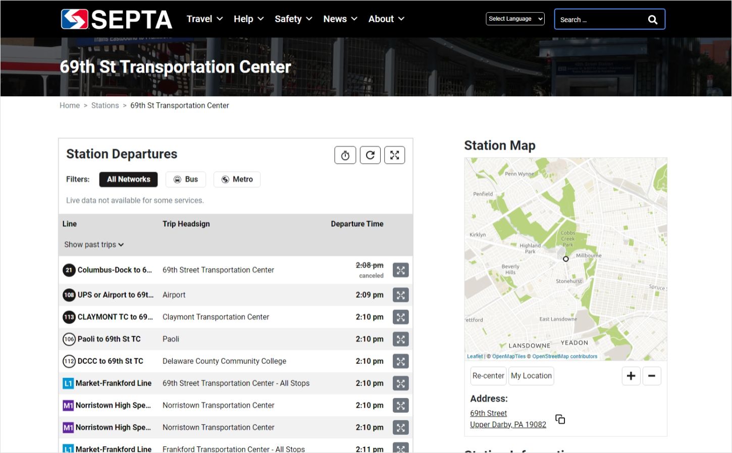
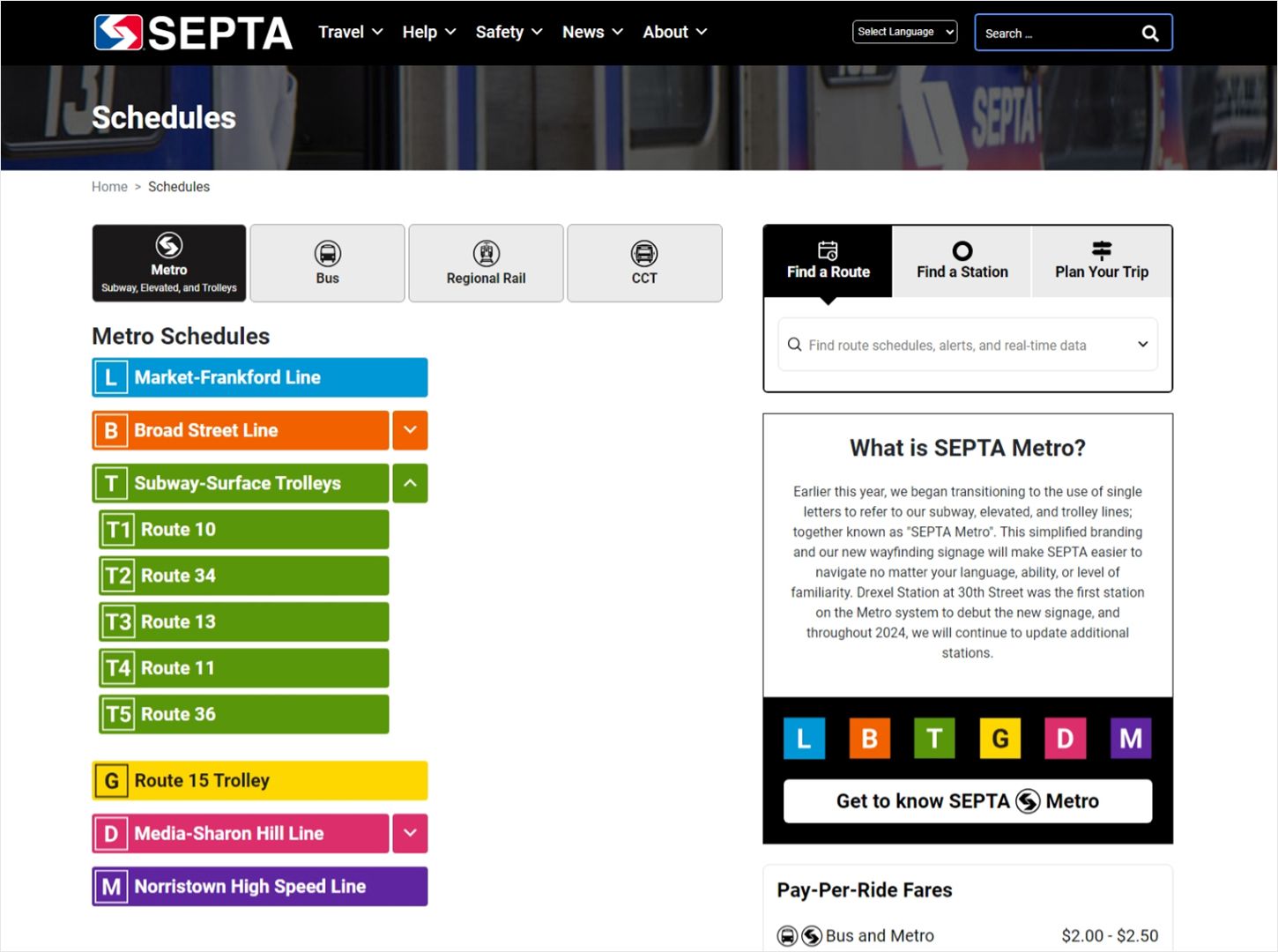
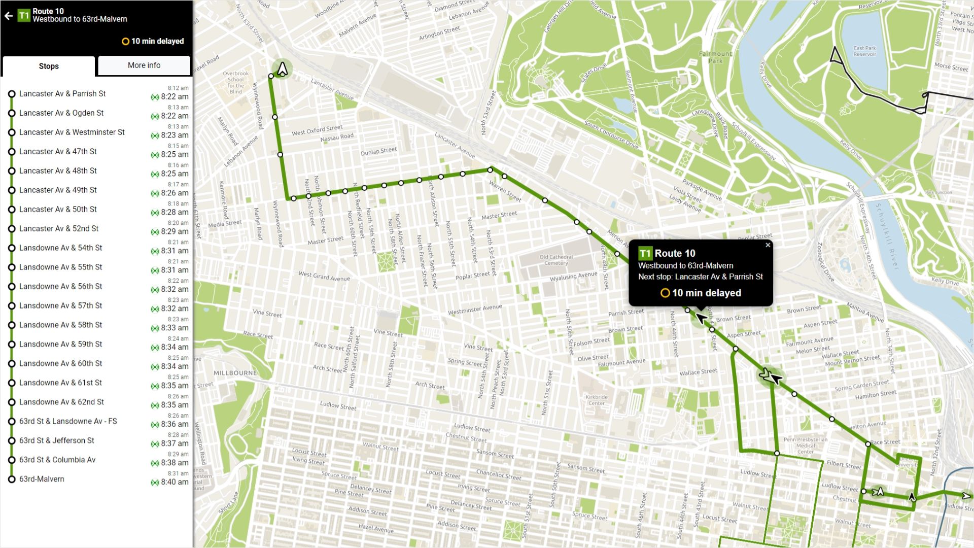
Additionally, the introduction of SEPTA METRO, a rebranded rail network, greatly influenced the site’s new design which makes use of METRO’s vibrant color palette, bold lettering, and iconography. The redesign introduced several new interactive real-time and trip planning features inspired by customer feedback, two of which were developed rapidly during the 3-month public beta period that occurred before launch. Two other customer-facing SEPTA websites were also integrated into SEPTA.org through the redesign project to reduce the burden of managing multiple products and unify the Authority’s online resources into a single hub. A highly collaborative and creative approach with our partners at SEPTA was pivotal to delivering a project of this scale, complexity, and public importance.
Results
The redesign process allowed SEPTA to transform its site from being organization-centric to customer-centric, providing a streamlined, mobile-optimized, and more accessible web experience with greater ease of use for people of all abilities and familiarity with the system. The site’s updated information, organization, features, and design helps both long-time and first-time SEPTA riders get where they need to go.
