EMPOWERING COMMUNICATION THROUGH MODERN DATA MANAGEMENT TOOLS

While we often view the world as a high-tech, seamlessly connected system, the reality is that much data is still exchanged in disconnected ways, and many multistep processes remain managed through methods that lack transparency and accessibility. McCormick Taylor’s GIS experts encounter these types of challenges on a daily basis and are armed with a variety of tools that help our clients manage data and communicate more effectively and efficiently. To celebrate GIS Day and learn more about these powerful, data-drive tools, we spoke to Katherine Weber, GISP, Associate Project Manager; Stephen Cline, GIS Developer III; and Emma Mullins, GIS Analyst I. Read more about their experiences below.

weber katherine

Katherine Weber | Survey123 and Experience Builder

Can you share a recent challenge you helped a client tackle?

McCormick Taylor’s New Jersey team has several annual contracts to evaluate sidewalk ramps for their ADA compliance. The team visits each ramp, collects data, decides whether the ramp needs to be redesigned, has the ramps slated for redesigned surveyed, and then handles the design work. Historically the team gathered the field data on paper and tracked the workflow using a color-coded spreadsheet. In 2024, our GIS group stepped in to create a field data collection form using Survey123, which greatly improved workflow efficiencies. In 2025, the GIS group collaborated with the New Jersey team to integrate GIS tools into their entire ADA ramp compliance workflow."

How were you able to help? What tools did you utilize?

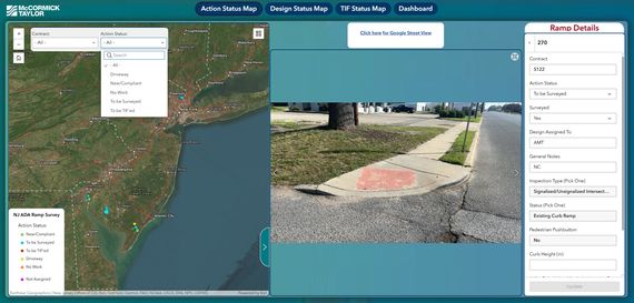
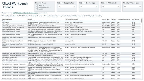
To help, I brought their ramp data into Experience Builder which provides a number of different ways for them to review, track, and edit their data.  First the data was brought into three different maps for three different phases of the project. The maps were set up with different queries to allow the user to isolate ramps based on certain attributes. When a query or series of queries is applied, the map pans and zooms to the resulting filtered ramps. Each map also has a photo carousel to view any photos associated with a selected ramp. Above the photo carousel is an option to view that ramp in Google Street View. The team found this feature to be extremely helpful because, instead of manually searching for the location in Google Street View, the Experience Builder app uses built-in code to take them directly to the ramp location in Google Maps. Each of these three maps also has an edit pane which allows the user to easily review details about each ramp and edit/update certain fields as needed. In addition to the maps, I created a dashboard of various charts to help the team quickly visualize the status of the ramps.


What was the end result?

The team’s prior method for tracking their work was cumbersome and time-consuming. By leveraging the data they already had housed in the field collected data in GIS, the Experience Builder app allowed them to filter, edit, and visualize that data in much more useful, effective, and time-saving ways.

dashboard
actionstatusmap
cline steve

Steve Cline | Web Maps and Experience Builder

Can you share a recent challenge you helped a client tackle?

I recently was asked to help with a project that started out as a small task. The task was to help PennDOT do field verification to place signs for the 9/11 Memorial Trail along PennDOT owned roads. The sign locations, coming from the 9/11 Trail Alliance, did not have any location details but were described as intersections in spreadsheets. Additionally, other firms were responsible for other counties. It was a data organization, standardization and tracking problem.

How were you able to help? What tools did you utilize?

Realizing the scale of the GIS task was larger than anticipated, we proposed a solution that would manage and track all the data. We first needed to geocode the intersections to mappable locations. Next, we came up with a standardized data schema so we could track each signs status as it progressed to field confirmation along with tracking important details like the sign type, district, and county information.


What was the end result?

Ultimately, we created a webmap we used to review and edit the signs. We shared the map with other consultants and PennDOT by using Groups in ArcGIS Online. We used Experience Builder (an ArcGIS Online application) to create a custom webmap for the various users to review and comment on the sign data in an easy way that all stakeholders could use. Our intention was to have all the sign data from all consultants viewable in our webmap.


Visit https://www.911trail.org/ to learn more about the 9/11 Memorial Trail.

trail sign inventory image
mullins emma

Emma Mullins | PowerBI Dashboard

Can you share a recent challenge you helped a client tackle?

Previously, the North Carolina Department of Transportation (NCDOT) Advancing Transportation through Linkages, Automation, and Screening (ATLAS) team was manually maintaining an 80+ page PDF document that contained each upload sorted by the tabs of the workbench, to provide information to users about data types and file naming conventions. This document was difficult to keep updated and error-free because it was updated by various ATLAS Business Team staff when time was available. This document was also difficult for users to navigate because of the length and due to the number of sections that were not relevant to all disciplines. Within the ATLAS database, more details are stored about each upload and the ATLAS Business Team deemed that this information would be beneficial to share with ATLAS users. The ATLAS Business Team requested McCormick Taylor’s assistance with developing a lower maintenance solution for sharing this information.

How were you able to help? What tools did you utilize?

I utilized Microsoft PowerBI to create a new way for ATLAS Users to access information about the ATLAS Workbench Uploads. This application was chosen because the ATLAS back-end database is kicked out to a Microsoft Access database daily and the ATLAS Business Team was already using PowerBI dashboards for other purposes. First a SQL query was developed to create a view of all the fields that contained information the ATLAS Business Team wanted to share. A mockup version of the dashboard was created from static data to share with the ATLAS Business Team before connecting to live data. After reviewing with the ATLAS Business Team, the SQL query was converted to a Power Query M language query while implementing the additional requested fields. The query was used to connect to the live version of the database and graphic elements were adjusted to meet the NCDOT design standards before delivery. This process required coordination with the NCDOT IT department to get the correct access and get the correct software downloaded on my NCDOT remote desktop.


What was the end result?

The result of this was a fully functional dashboard that serves to replace the PDF document previously maintained by ATLAS. This dashboard allows users to select specific project phases, disciplines, upload data type, or search for a specific upload. The results show the upload naming conventions, the upload format, and if the upload is secure or requires external collaboration. This dashboard will allow the data to be updated more regularly, reduce the time spent by the ATLAS Business Team to update the PDF, and reduce the potential for human error.

atlasuploadcontrolsfinaldashboard
atlasuploadcontrolscodesnippet